Motion Designer | Graphic Designer | Motion Designer | Graphic Designer | Motion Designer | Graphic Designer |
HealthMosaic
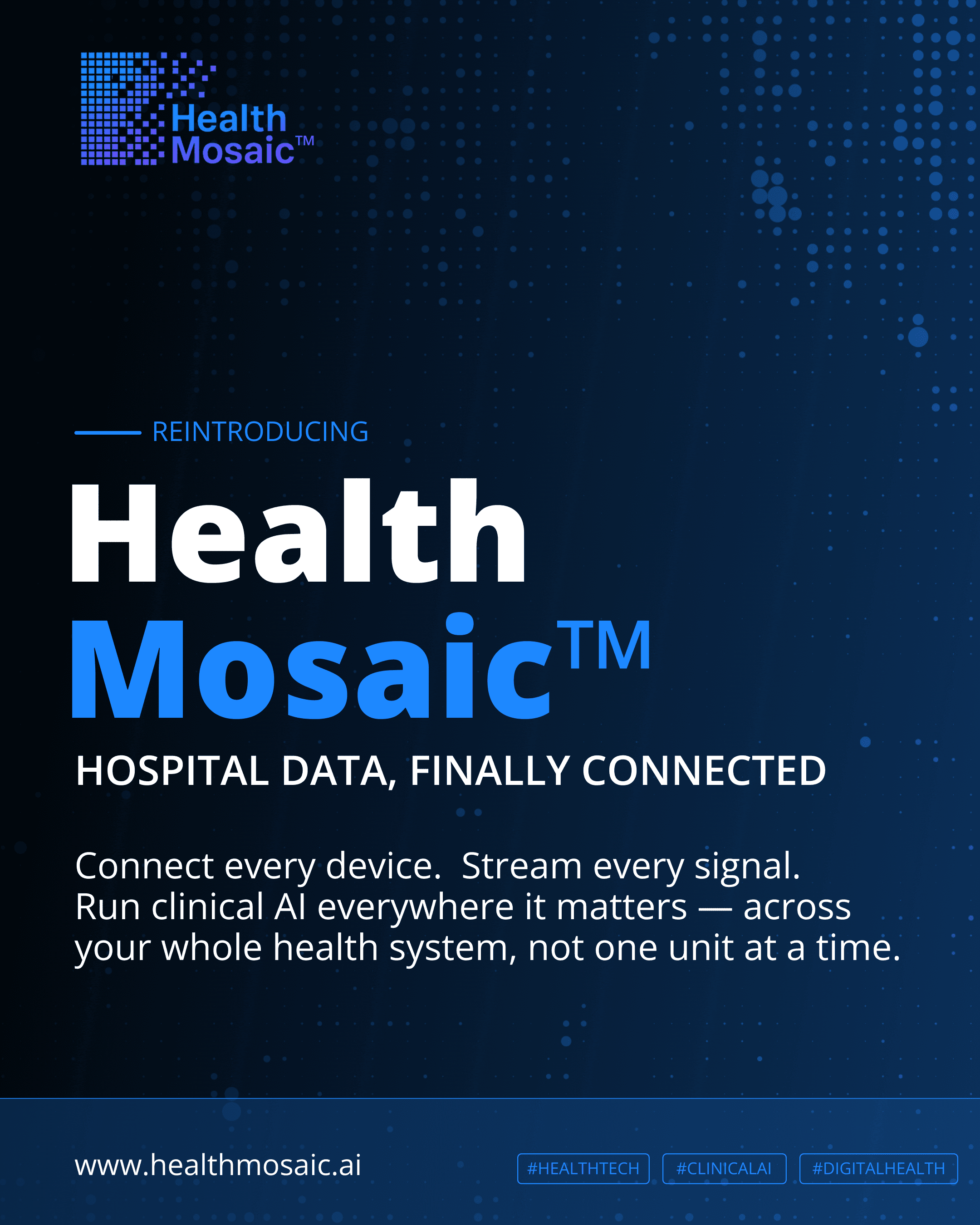
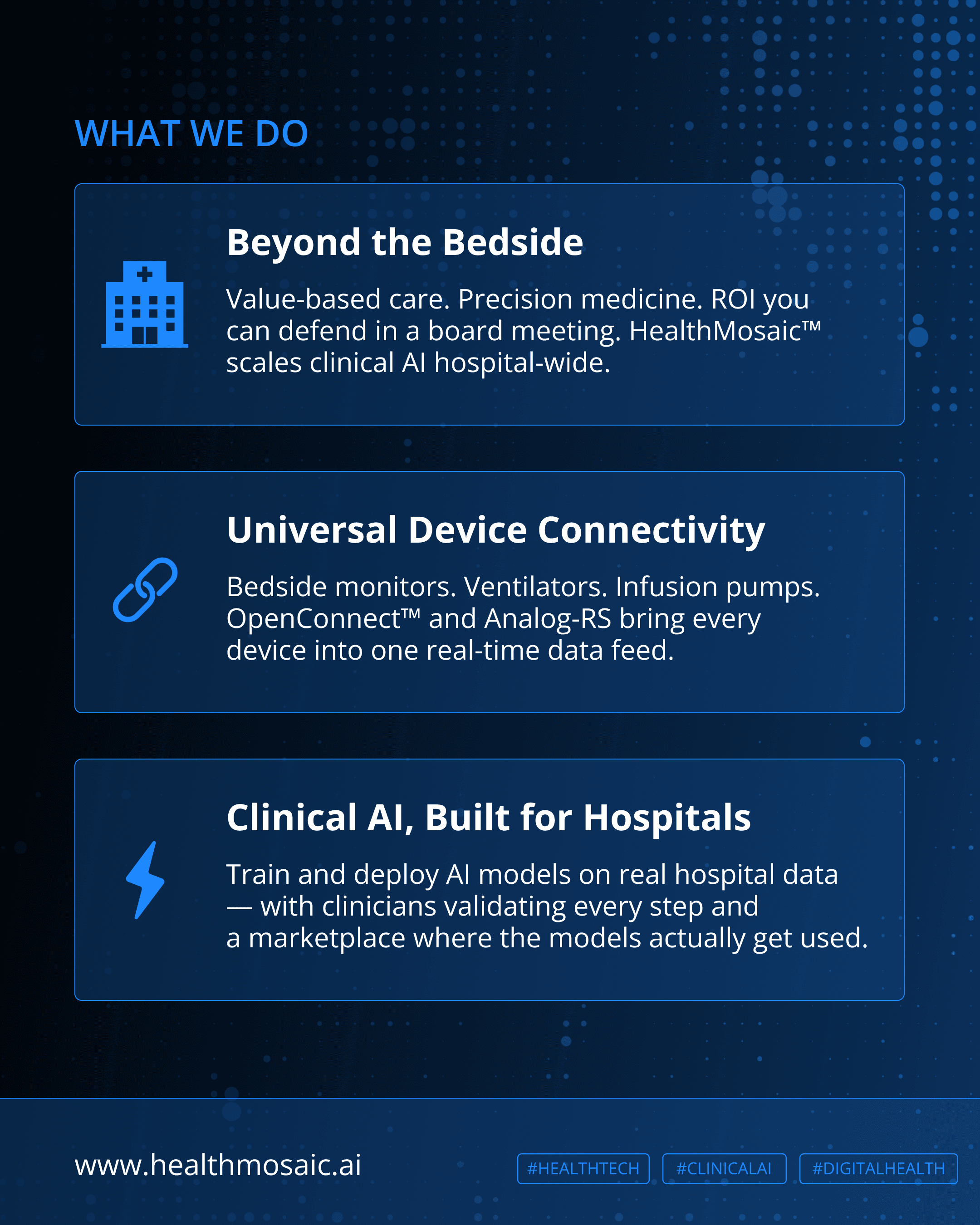

Re-establish HealthMosaic™ in the market with a clarified brand identity and product positioning. The post functions as a reset — announcing who they are, what they do, and why it matters — targeting health system buyers and clinical AI stakeholders who may have encountered the brand before but needed a clearer value proposition.
Health Mosaic is a seed-stage healthtech company building the operating system for clinical AI. They needed a LinkedIn video that communicated a complex, technical product story — hardware, platform, and marketplace — to a senior B2B audience, without leaning on generic healthcare visuals or jargon-heavy copy.
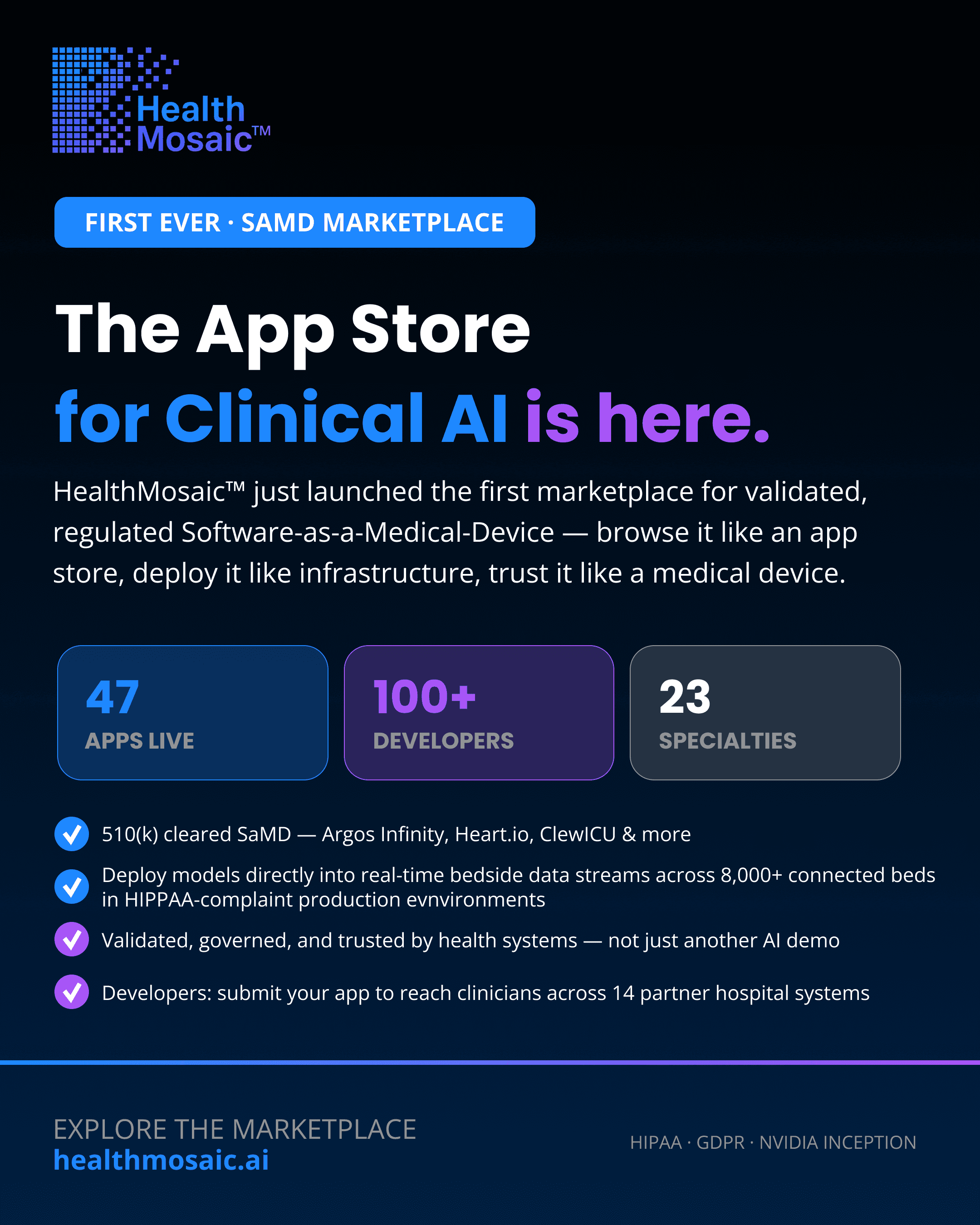

Announce the launch of HealthMosaic™'s SaMD Marketplace — the first-ever platform for validated, regulated clinical AI apps — to health system decision-makers, clinical AI developers, and the broader digital health community. Drive awareness, credibility, and traffic to healthmosaic.ai.


Single-page vertical graphic (social/web asset) for the HealthMosaic case study series, spotlighting the UAB Hospital tele-ICU deployment. Turn a customer deployment into a scannable proof-point asset that builds credibility and drives demo bookings. Should work as a standalone share (LinkedIn, sales deck, website case study page) without needing the full written case study.


For our HealthMosaic newsletter promo, I created a LinkedIn graphic to drive subscriptions to our Mosaic Insights newsletter following AAMI eXchange 2026. The brief called for a bold, benefit-driven headline, a clear subscribe CTA, and a dark, gradient-driven visual style that would signal innovation and credibility in the healthcare IT space.


For our TetraCom device integration launch, I created a product announcement graphic to promote TetraCom's live connectivity with the HealthMosaic platform. The brief called for two clean product shots of the device, a bold "TetraCom is live on HealthMosaic" headline with a color-accented callout word, and a concise value statement explaining automatic EHR data flow with no manual charting. Supporting stat callouts (device-to-EHR speed, secure transport protocol, zero manual entry) reinforced the product's speed and reliability, all set within HealthMosaic's dark, gradient-driven brand style to stay consistent with the broader visual identity.
gigidegli@gmail.com | gigidegli@gmail.com | gigidegli@gmail.com | gigidegli@gmail.com | gigidegli@gmail.com